RailScanner
I built Railscanner to figure out the cheapest days to travel into the office without checking train prices every day. It pulls fares from Trainline and TrainPal, then shows the best options across the next six weeks in one place. With simple filters and clear insights, it makes it easy to spot when it’s actually worth travelling.
- Year
- 2026
Stack
- Webscraping
- REST API
- UI/UX Design
- React
- Content Modelling
- TailwindCSS
- TypeScript
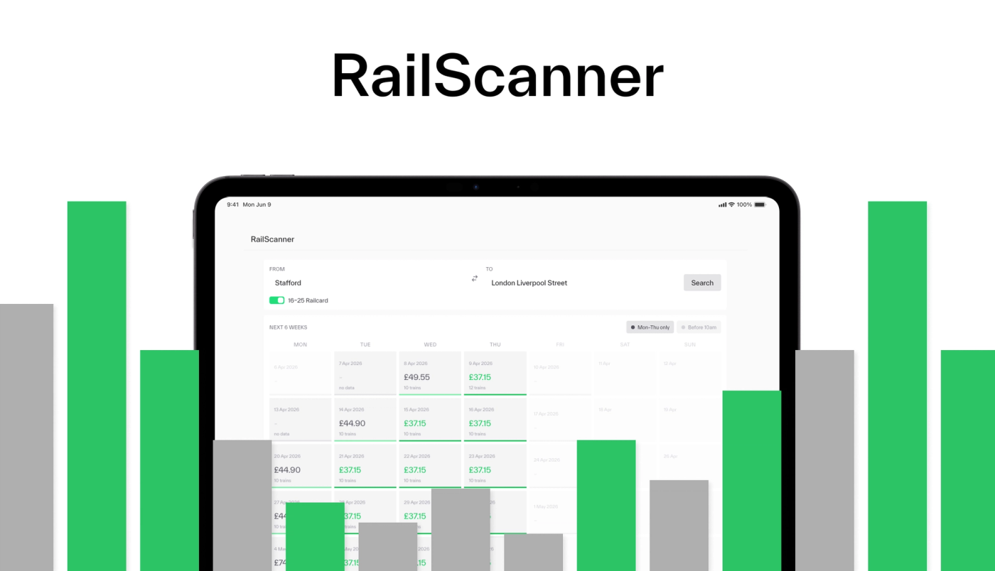
A simpler way to understand train costs
Railscanner came from a problem I kept running into when looking at train fares: I could find the price for a particular journey, but it was difficult to see whether travelling on another day would be significantly cheaper. I built Railscanner to show fares across a six-week period in one place, making those differences much easier to spot.
Built around real-world constraints
The project was driven by a specific need: finding the most cost-effective days to travel into the office. This constraint shaped key features in the interface. Users can filter journeys that arrive before a set time, such as 10am, ensuring results remain practical, not just cheap. By narrowing the scope to journeys that actually fit a routine, the tool avoids the common trap of optimising for price alone without context.
Turning raw data into useful signals
Beyond search, Railscanner introduces an insights panel that translates raw fare data into meaningful summaries. Over a six-week period, it highlights the cheapest and most expensive travel dates, calculates an average fare, and identifies trends in pricing week over week. Breaking this down further, it reveals how costs vary by day of the week, making it easy to spot consistent savings opportunities. For example, travelling on a Thursday instead of a Monday can result in significant monthly savings, a pattern that would be difficult to detect through manual searching.
Designed for forward-planning
I kept the interface deliberately simple, with price and journey time taking priority. Filters update the results immediately, while charts help show how fares change across the six-week period. The insights panel then pulls out useful patterns, such as the cheapest dates or days of the week, without requiring the user to analyse the data themselves.