Portfolio Design System
An interactive case study exploring how a small set of design rules can shape an entire website. It combines architectural influences, a custom theme system and accessibility checks, with an interactive editor that lets you change the design and see the results across the site.
- Year
- 2026
Stack
- Next.js
- React
- TypeScript
- TailwindCSS
- Framer Motion
- Component-Driven Design
- Content Modelling
- UI/UX Design
- Product Design
A visual experiment
I wanted to see how much I could do with a small set of design rules.
The starting point was a limited colour palette, a couple of typefaces, and a few rules for things like corners and line thickness. I also wanted to turn the experiment into something interactive, so the themes could be applied to the whole site.
Keeping things simple
The themes are built around a small number of variables: colours, typography, border radius and line thickness.
I wanted to keep the number of colours down. Having too many colours can make a design feel inconsistent, so I tried to get as much variety as possible from a small palette.
Everything is controlled from the same set of values, which means changing a theme changes the whole site.
Inspired by architecture
The themes are based on architects and designers whose work I like.
Le Corbusier's themes use colours from his Polychromie Architecturale palette. The others are my own interpretations of Bauhaus, Gaudí and Frank Lloyd Wright.

I wanted the themes to change more than just the colours, so they also change things like typography, corner radius and line thickness.
Making it interactive
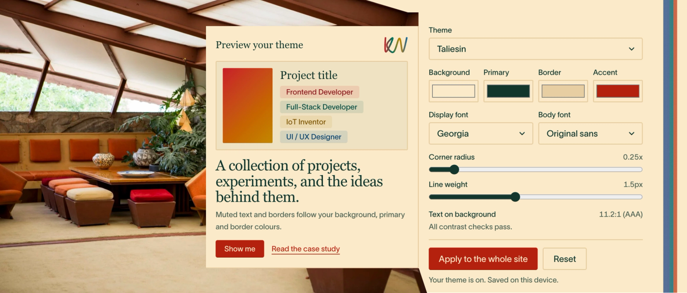
The theme editor is part of the case study. You can change the colours, typography, corners and line thickness and see the changes across the site.
Project title
A collection of projects, experiments, and the ideas behind them.
Muted text and borders follow your background, primary and border colours.
Text on background10.1:1 (AAA)
All contrast checks pass.
Try it out! This is an interactive case study ⟢
You can also start with one of the architectural themes and make your own version. Everything happens in the browser, so you can experiment without affecting the original design.
Keeping it accessible
Once I started letting people create their own colour combinations, I needed a way to make sure they were still usable.
The system checks text against its background and adjusts the colour until it reaches a 4.5:1 contrast ratio. It also warns when other combinations, such as borders and accents, don't have enough contrast.
Building the system
The whole site uses CSS variables for the design values, so there is one source for the colours, typography and other visual properties.
I also added tests to check that the colours used in the code match the stylesheet. This means I can change the system without having to manually check every part of the site.
It's built with Next.js, React, TypeScript and Tailwind, with the content managed through Sanity.