Error States
Error states are more than just “something went wrong” messages; they are moments of truth for the user experience. Done well, they reduce frustration, build trust, and guide users confidently to the next step. In recent work, I've designed error states that are clear, empathetic, and actionable, turning friction into an opportunity to communicate with care.
- Year
- 2025
Stack
- Figma
Clear and Meaningful Visuals
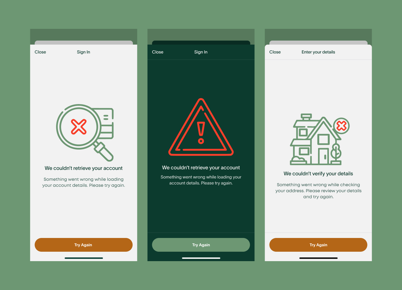
Visuals help users to understand what’s happening at a glance. I defined guidelines that included contextually relevant illustrations or icons that directly reflect the scenario. For example, a failed address verification is paired with a house illustration rather than a generic warning triangle. Illustrated-style icons maintain a friendly, human touch while reinforcing the message.
Speaking Sense
As part of this project, I avoided headings like “Something went wrong” because they provide no guidance. Instead, headings are specific, empathetic, and immediately informative, e.g., “We couldn’t verify your details.” Semibold typography is used to help the heading stand out without being alarming.
Providing Empathetical Guidance
The body copy explains what has happened and, more importantly, what the user can do next. “Please check your details and try again, or contact support if the issue persists.” Technical codes and internal system information stay in the logs rather than appearing in the interface. I wanted each error state to help someone recover from the problem rather than simply tell them that something had gone wrong.