Car Configurator
A self-initiated concept for a luxury car configurator
Having an eye for design means noticing the small details that most people overlook. While exploring this configurator, I saw moments that could be clearer, more engaging, or more immersive, so I treated it as an opportunity to apply a solution I would genuinely want to use myself.
- Year
- 2025
Stack
- Figma
- UI/UX Design
Behind the Wheel of Design
I've always loved cars, not just how they look, but the engineering, craftsmanship, and stories behind them. While using a luxury car configurator, I started noticing places where that story seemed to disappear behind the interface. I wanted to explore whether the experience could be made clearer while still feeling appropriate for the car and brand.
Preserving Heritage
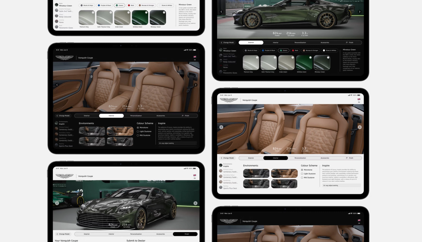
One of the largest UX challenges was managing a high volume of product information without overwhelming users. I reimagined the information architecture so contextual storytelling appears at the moment of decision. For example, selecting an exterior colour reveals its heritage within the configuration panel itself, reducing cognitive load while increasing perceived value.

Streamlining the Journey Without Losing Luxury
I had a close look at the journey itself. The current journey spans five steps, so in my concept I combined two interior-related steps into one for clarity and flow, then introduced a "Finish" step marked with a racing flag, a subtle nod to the brand's British racing legacy. A full-width progress indicator also reinforces system status visibility, ensuring users always understand where they are within the flow.

Navigation That Keeps the Car in Focus
The vehicle itself should remain the primary focal point. To support this, I introduced a persistent configuration panel that enables adjustments without disrupting the main preview. This reduces interface jumps and preserves spatial consistency, which is key to maintaining immersion.
I replaced long, text-heavy colour menus with visual filters and preview indicators, allowing faster comparison and recognition over recall. This decision was grounded in established usability heuristics, prioritising efficiency and clarity.

Luxury in Light and Dark
The brand's audience spans a global, diverse demographic, from long-standing enthusiasts to a newer generation of drivers drawn in by newer models designed to appeal to a younger and more gender-balanced audience. With this in mind, I introduced both light and dark modes to suit personal preference and environmental context worldwide.

Attention to Detail
Performance figures are an important part of the car, but they disappeared quite quickly in the current configurator. I kept the key figures beneath the main car visual throughout the configurator, so details such as power and performance remain visible while the user makes aesthetic choices.

The Finish Step: Small Feature, Big Impact
My favourite part of the concept is actually the Finish step. It closes the configuration journey elegantly, giving users an immediate takeaway in the form of a brochure, while allowing the opportunity to engage further. It's a small feature, but one that speaks to the luxury experience.

This is an independent concept made for my portfolio. It is not affiliated with, endorsed by, or commissioned by any car manufacturer, and any brand names, logos, or vehicle imagery shown belong to their respective owners.